Choosing a Retro Gas Pump Sign can give your business a memorable roadside identity. Its curved edges, bold lettering, and warm red or cream finish can suggest classic service stations without copying a specific brand. However, appearance is only one part of a reliable purchasing decision.
Consider where the sign will hang, how customers will view it, and what weather it must withstand. A large outdoor sign needs powder-coated metal, UV-resistant paint, secure mounting points, and protected wiring if illumination is included. Check local sign requirements before ordering, especially for size, brightness, electrical installation, and placement near roads. A qualified installer can help prevent loose brackets, glare, or water damage.
Material quality matters more than a convincing photograph. Ask suppliers about steel thickness, coating methods, LED lifespan, replacement parts, and warranty coverage. Request real product images when possible. Some vintage-style signs look excellent online but feel thin and poorly finished in person. That mistake is easy to make.
Your brand should guide the colors and wording. A diner may suit faded turquoise, while an auto workshop could use deep navy and white. Keep the message readable from a moving vehicle. Test the sign from the parking entrance and across the street. Small details matter. A slightly imperfect finish may create character, but careless rust or uneven lettering suggests neglect. The best choice balances nostalgia, durability, visibility, and responsible installation, creating a sign that attracts attention without overwhelming your storefront.
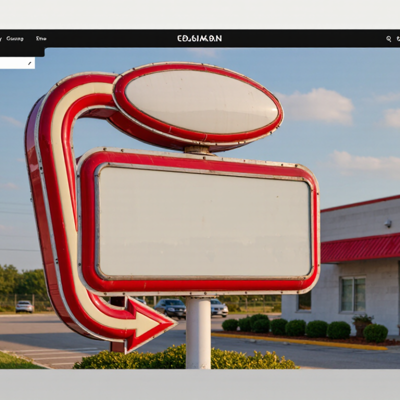
A retro gas pump sign should support your business identity, not compete with it. Before choosing a design, clarify your brand’s character. A family diner may need warm colors and rounded lettering. An auto service shop may suit stronger lines and industrial details. Keep the message simple. Drivers often notice signs for only a few seconds.
Location affects every design decision. A sign beside a busy road needs bold shapes, strong contrast, and limited wording. A wall sign near an entrance can include smaller details because visitors stand closer. Measure the mounting area carefully. Check nearby lighting, trees, building colors, and traffic direction. A beautiful sign can disappear behind a branch or glare.
Viewing distance is easy to underestimate. Measure from the nearest customer path and the farthest practical viewing point. Then test the lettering at that distance, even with a temporary paper mockup.
In my experience, this reveals weak contrast quickly. I once chose decorative lettering that looked excellent indoors but became unreadable outside. That mistake changed my approach.
Retro charm should remain visible after sunset and from an angle. Weather-resistant materials, sealed edges, and stable mounting hardware also matter. Ask the fabricator about cleaning, fading, and maintenance before ordering. A slightly simpler design may perform better, although it can feel less exciting at the beginning.
A retro gas pump sign should attract attention before customers reach your entrance. Lighting choice strongly affects its visibility, operating cost, and maintenance schedule. The U.S. Department of Energy’s Energy Saver guidance reports that LED lighting uses at least 75% less energy and lasts up to 25 times longer than incandescent lighting. That difference matters for signs operating twelve hours each night.
LED modules also produce steady illumination across curved panels and narrow lettering. Choose a sealed housing for rain, dust, and temperature changes. Check the sign’s color temperature carefully. Warm white can support an authentic vintage appearance, while cooler white improves visual sharpness. Too much brightness may create glare. That weakens the design.
The DOE Solid-State Lighting research reports continuing improvements in LED efficacy and thermal performance. However, real savings depend on operating hours, power supply efficiency, installation quality, and controls. I would not choose a sign by headline numbers alone. That assumption can fail. Inspect the driver rating, ventilation space, wiring access, and replacement process before ordering. A dimming function may reduce energy use during quieter hours, but it adds components and possible maintenance. Ask for measured wattage, expected service life, and photometric information. Small details matter. The best retro sign should look convincingly old while working like dependable modern equipment.
A retro gas pump sign can attract attention before customers enter your business. However, its appearance should not outweigh weather protection. For outdoor placement, check the enclosure rating carefully. IEC 60529 IP65 means the sign is dust-tight and protected against water jets from any direction. It does not mean the sign can survive flooding or temporary immersion.
I once chose a decorative sign mainly for its bright color and vintage shape. The frame looked sturdy, but the cable entry collected moisture after several storms. That experience changed my selection process. Examine the housing, gasket, fasteners, and cable glands closely. They should fit tightly, without visible gaps. Ask for test documentation showing the IP65 rating, rather than trusting a product description alone.
Mounting details also affect real-world protection. Place the sign beneath a shallow canopy when possible, while keeping it visible from the street. Use corrosion-resistant hardware and avoid drilling through sealed areas. Inspect the gasket after installation and check for cracks each season. IP65 is strong protection, not a maintenance replacement. Dust can still gather around connectors, and aging seals may weaken. A small inspection now can prevent dim lighting, internal corrosion, or an expensive replacement later. The most attractive sign is not always the most dependable one.
| Selection Dimension | Recommended Specification | Why It Matters | Practical Check Before Purchase |
|---|---|---|---|
| Weather Protection | IEC 60529 IP65: dust-tight and protected against water jets from any direction. | Outdoor signs are exposed to dust, rain, splash, and routine cleaning. | Request the IP rating for the complete assembled sign, not only for an individual component. |
| Meaning of IP65 | The first digit, 6, indicates dust-tight construction. The second digit, 5, indicates protection against water jets. | It provides a clear, standardized way to compare enclosure resistance to solids and water. | Confirm that the test documentation refers to IEC 60529 or an equivalent national adoption. |
| Water Exposure Limit | IP65 is not a rating for immersion and does not guarantee protection against high-pressure or high-temperature cleaning. | Incorrect cleaning methods can force water past seals, cable entries, or service openings. | Keep the sign away from direct pressure-washer spray and follow the supplier’s cleaning instructions. |
| Installation Location | Use a weather-protected outdoor sign for façades, forecourts, entrances, cafés, garages, and themed retail spaces. | A sheltered position reduces direct rain and sunlight exposure while improving service life. | Measure wall clearance, viewing distance, mounting height, and the direction of prevailing rain. |
| Enclosure Material | Powder-coated steel or aluminum with corrosion-resistant fasteners and sealed joints. | Metal construction supports a vintage appearance and helps resist outdoor wear when properly finished. | Check coating quality, drainage provisions, edge protection, and fastener material. |
| Lighting Type | Sealed LED illumination with a warm-white color temperature around 2700–3000 K for a classic appearance. | LEDs generally use less energy and produce less heat than traditional incandescent lighting. | Verify the LED driver’s outdoor suitability, ventilation requirements, and replacement method. |
| Electrical Supply | Select a voltage compatible with the local electrical system and use an appropriately rated outdoor connection. | Correct voltage and protected wiring reduce the risk of malfunction and electrical hazards. | Confirm input voltage, power consumption, grounding requirements, cable length, and connection method. |
| Visibility and Size | Choose dimensions and contrast according to the viewing distance, mounting height, and surrounding lighting. | A sign that is attractive but too small or dim may not be noticed by passing customers. | Review a scaled drawing and assess readability during both daytime and nighttime conditions. |
| Mounting Hardware | Use secure brackets, corrosion-resistant hardware, and fixings suitable for the wall or support structure. | Wind load and vibration can loosen an inadequately supported sign. | Check the sign weight, fixing points, substrate condition, local wind exposure, and professional installation requirements. |
| Maintenance Access | Use a design with accessible service panels, replaceable seals, and protected cable glands. | Routine inspection helps preserve sealing performance and lighting reliability. | Ask how seals, LEDs, drivers, and transparent covers can be inspected or replaced without damaging the enclosure. |
Specification note: IEC 60529 IP65 indicates a dust-tight enclosure and protection against water jets. It does not indicate protection against immersion, so the sign should be installed and cleaned according to its documented limitations.
A retro gas pump sign can create a strong roadside impression. Safety must guide the design. NFPA 30A and NEC Article 514 address motor-fuel dispensing areas and electrical installations. They do not approve a sign based on appearance alone. A sign with lighting, wiring, or internal components may interact with a classified hazardous location. Its position, enclosure, wiring method, and disconnecting means need professional review.
Check the sign’s intended location before choosing its style. Keep it away from dispensers, vehicle paths, vents, and fuel-release points unless the design meets applicable requirements. Use equipment suitable for the identified location. Confirm grounding, bonding, weather protection, and listed components. Local code adoption can differ, so consult the current code edition and the authority having jurisdiction. A common mistake is treating a decorative sign as harmless. Electricity can change that assumption quickly. The installation may look simple, but field conditions often are not.
Tips: Ask a qualified electrical professional to review a site plan. Mark dispenser zones, canopy edges, access routes, and emergency shutoff locations. Check whether the sign blocks visibility or creates a collision hazard. Request product documentation before purchase. Do not rely on a vintage appearance as proof of compliance. Reconsider the design if maintenance requires workers to enter a hazardous area. That extra review may feel excessive, yet it can prevent costly changes later.